Editorial and Book Design
A series of projects involving editorial layouts and designs, editorial illustrations, and book designs.
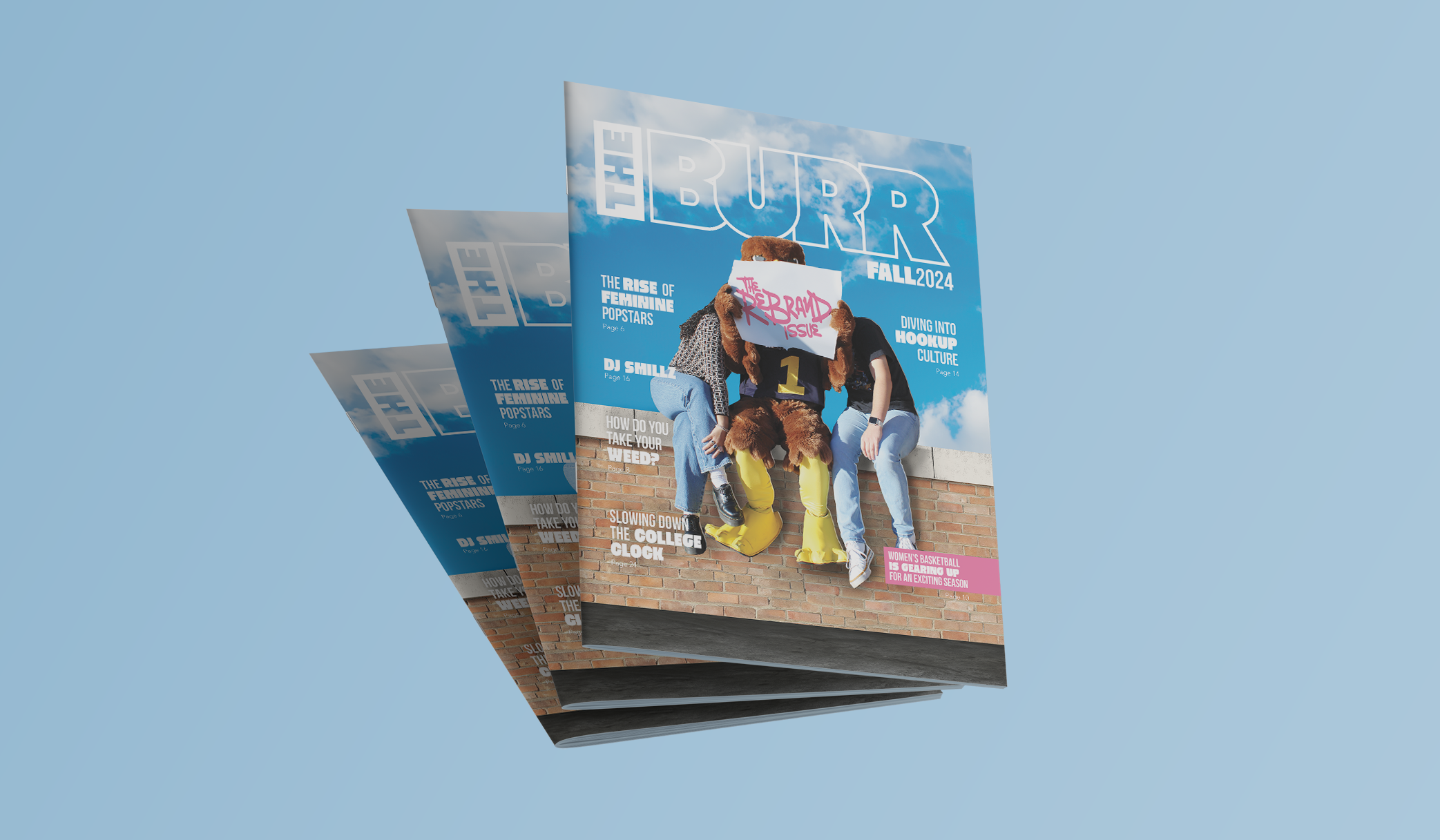
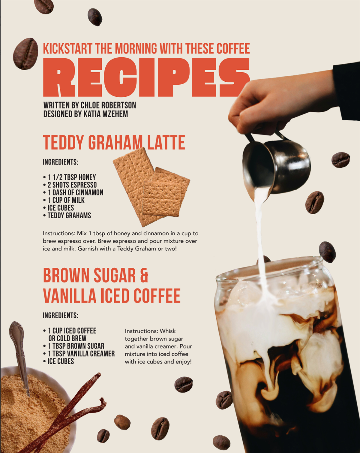
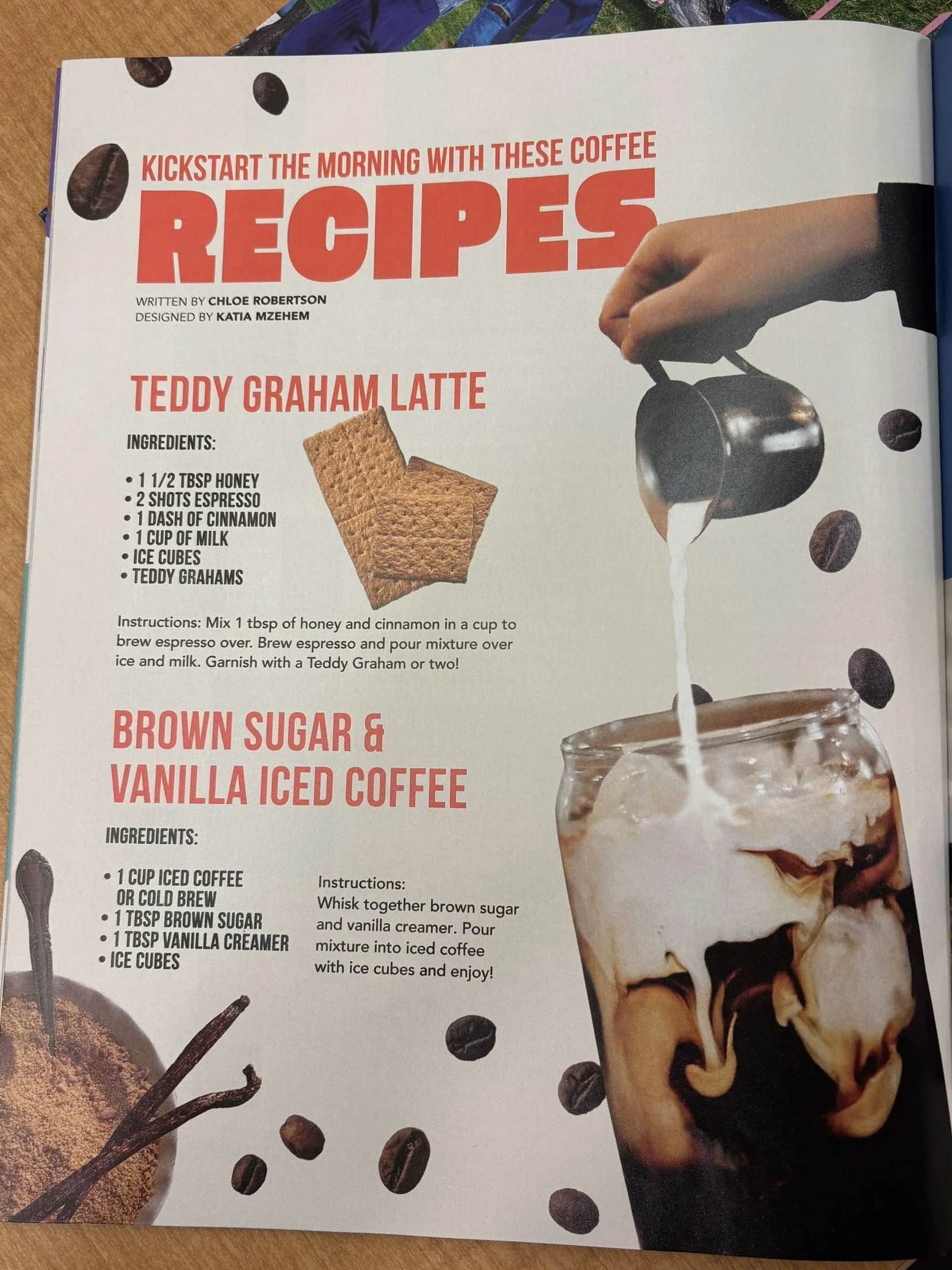
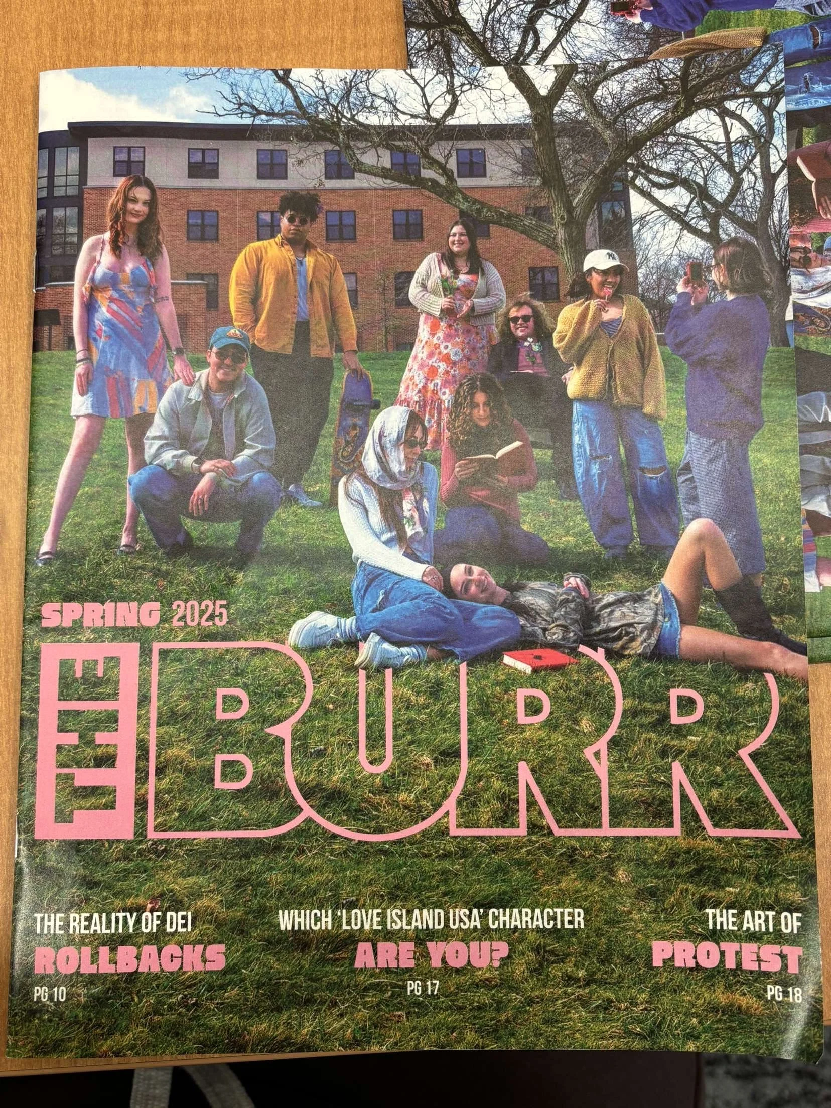
As Web Director and Designer, being a part of this Rebrand issue. I had the opportunity to design a page for the print issue and redesign/update The Burr's website. The Burr Magazine's Fall 2024 print issue is on stands and below is a mockup of the designs:
The Burr's website: https://theburr.com/
Burr Magazine:
Project Overview:


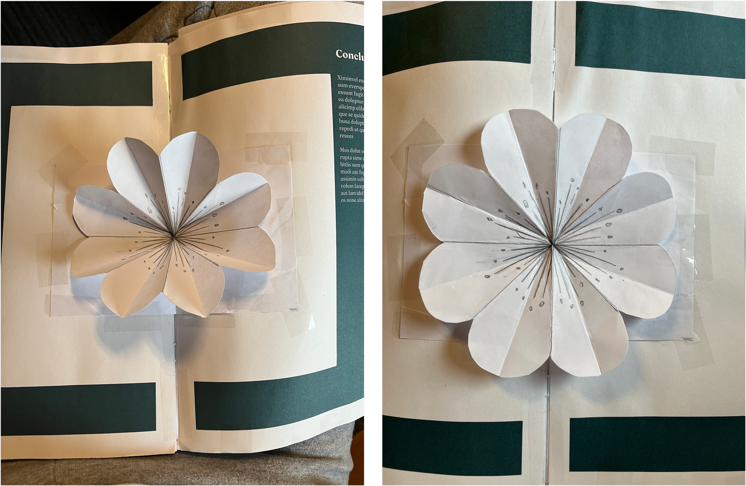
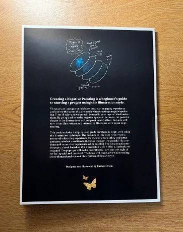
Visual Narrative: Pop Up Book
Project Overview:
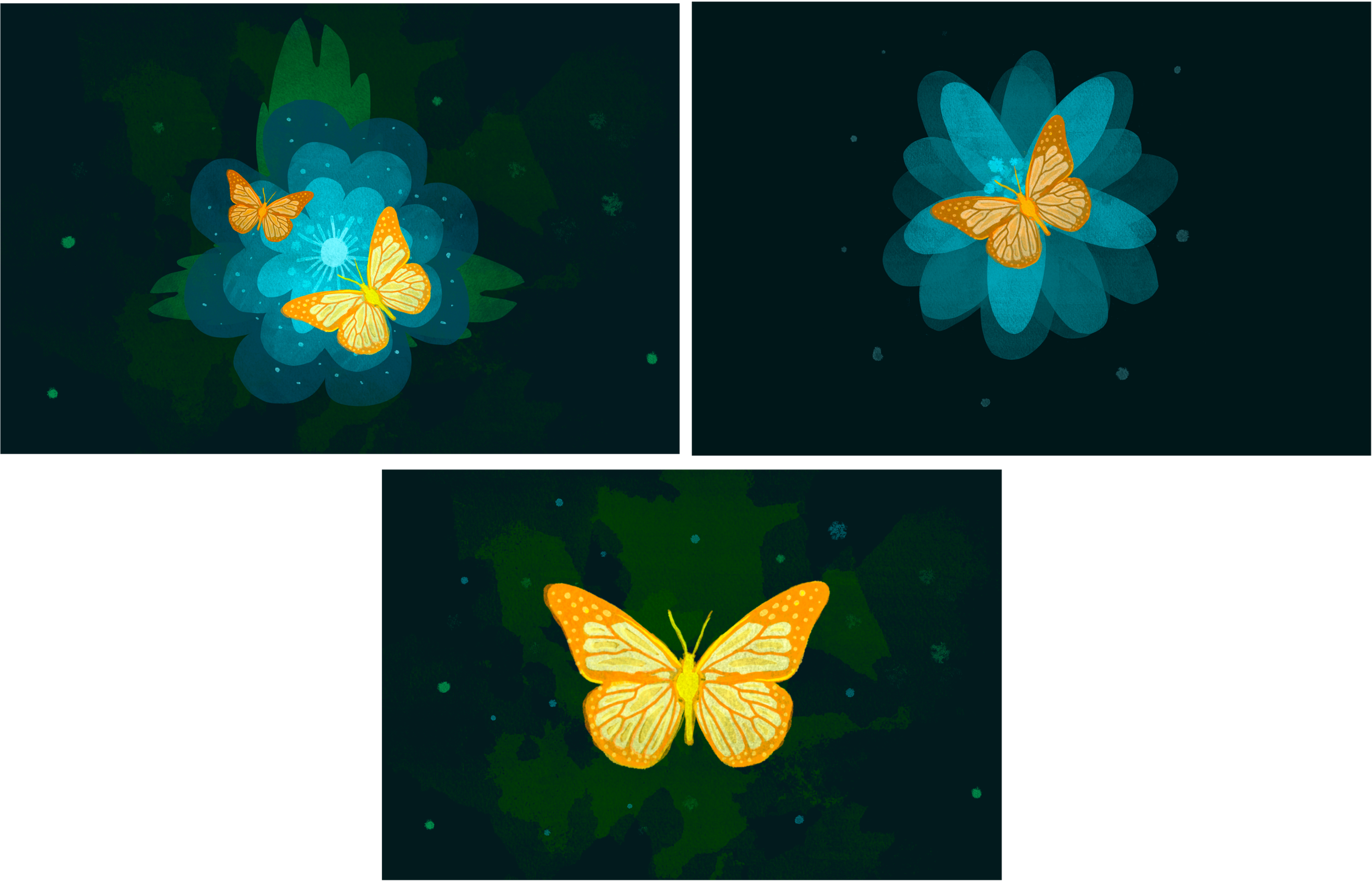
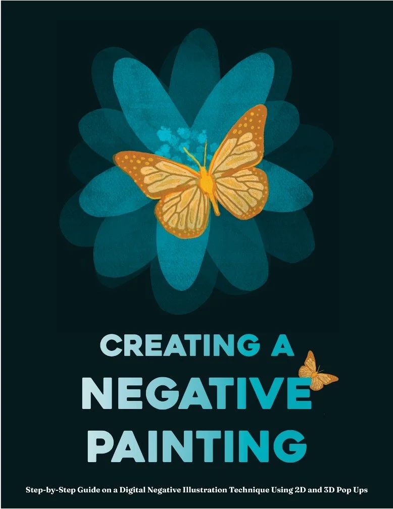
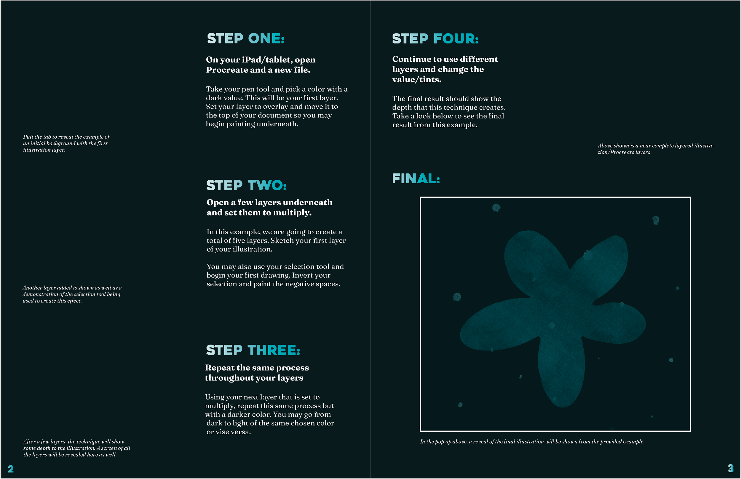
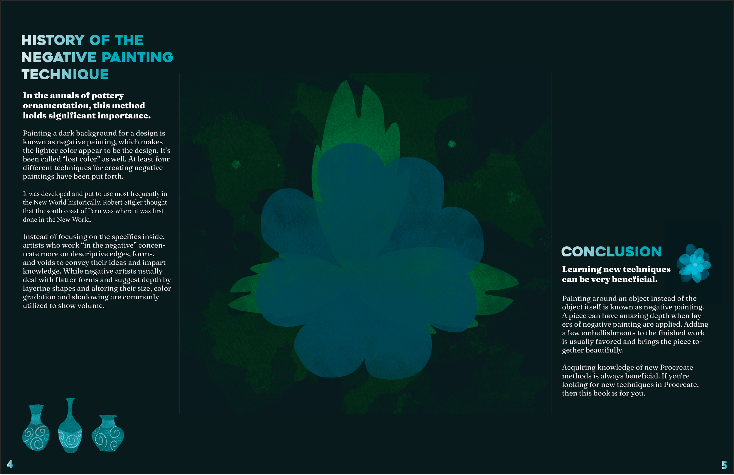
Project Goals: For this project, I have decided to experience learning a digital art technique called negative painting for the first time. I wanted to explore this technique in illustration. My experience will be documented through photography and notes. I want to accomplish a design artifact that will be a "how to" pop-up book using this art style. I will learn paper engineering that will combine visual art and an interactive reading experience for the user. Negative art is a technique where you illustrate around the subject rather than on the subject. This creates negative space. The how-to book will utilize this art style to make an engaging experience with the pop-ups. Once I document my experience learning this illustration technique, I will begin my research planning on pop-ups within a book, paper engineering, and layout. I will start sketching layouts for my narrative book as well to find where I can add my illustrations and steps to make them. A fully functional prototype will be built. Then a test print will be made, followed by revisions and the final prototype.
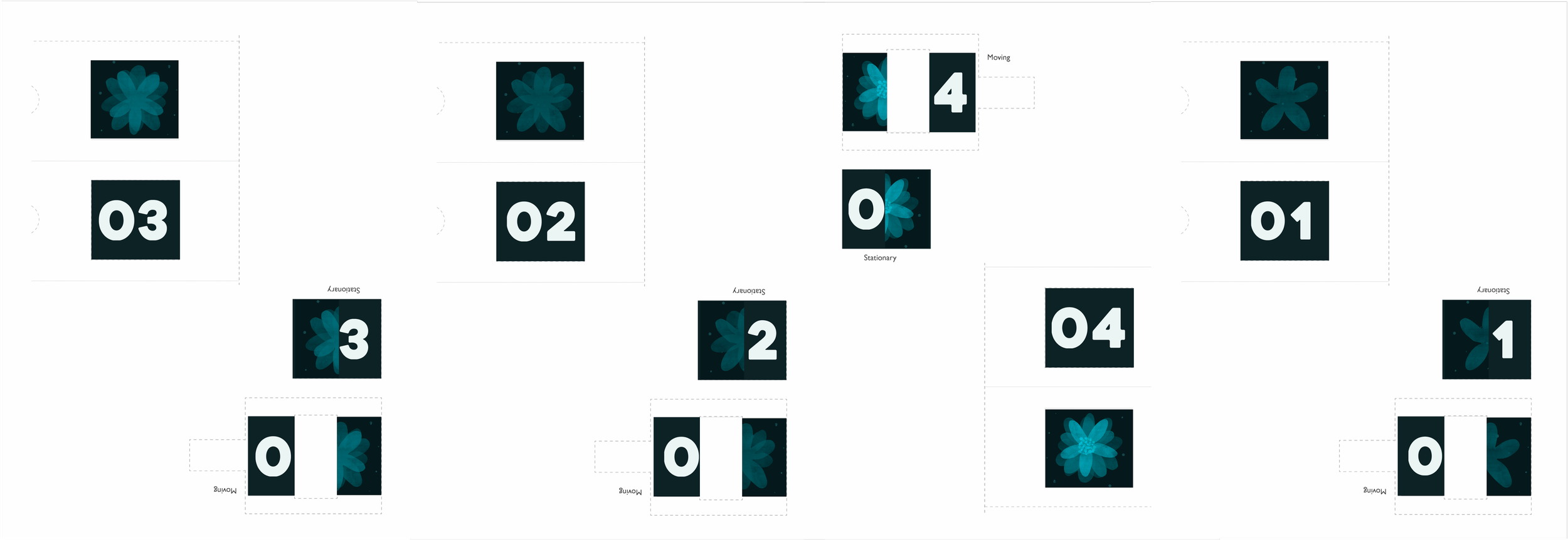
Outline Deliverables: The deliverables will be a pop-out how-to book including illustrations based on the negative painting art style. The book will be hand-made and designed. Each page will have many pull-tab pop-ups. The final page will be a display of an illustration that I made in my experience learning this technique as a layered pop-up or mechanical pop-up.


Editorial Design - “Overthinking at Night?”
Project Overview:
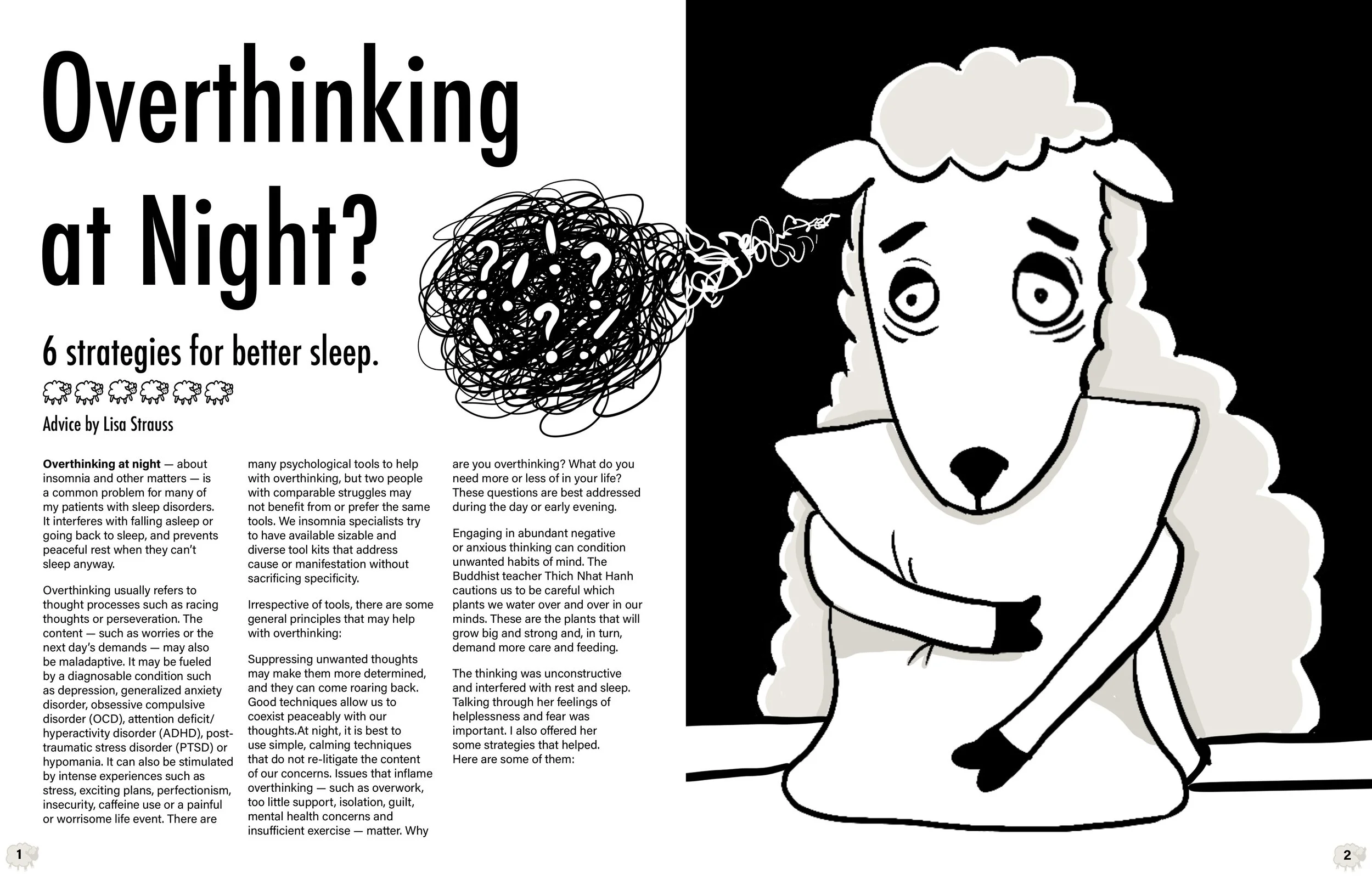
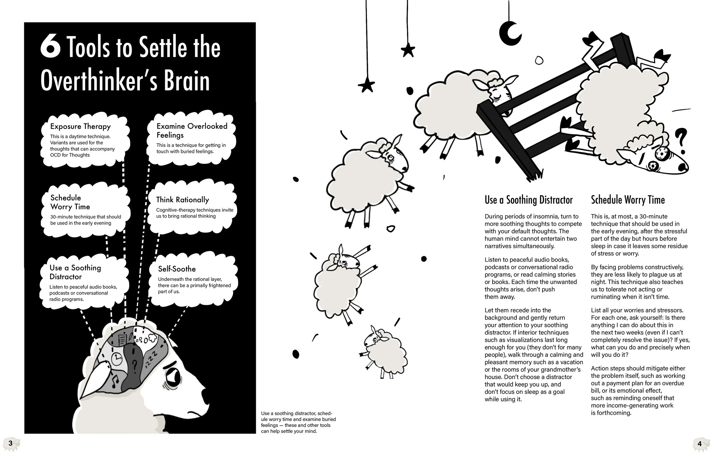
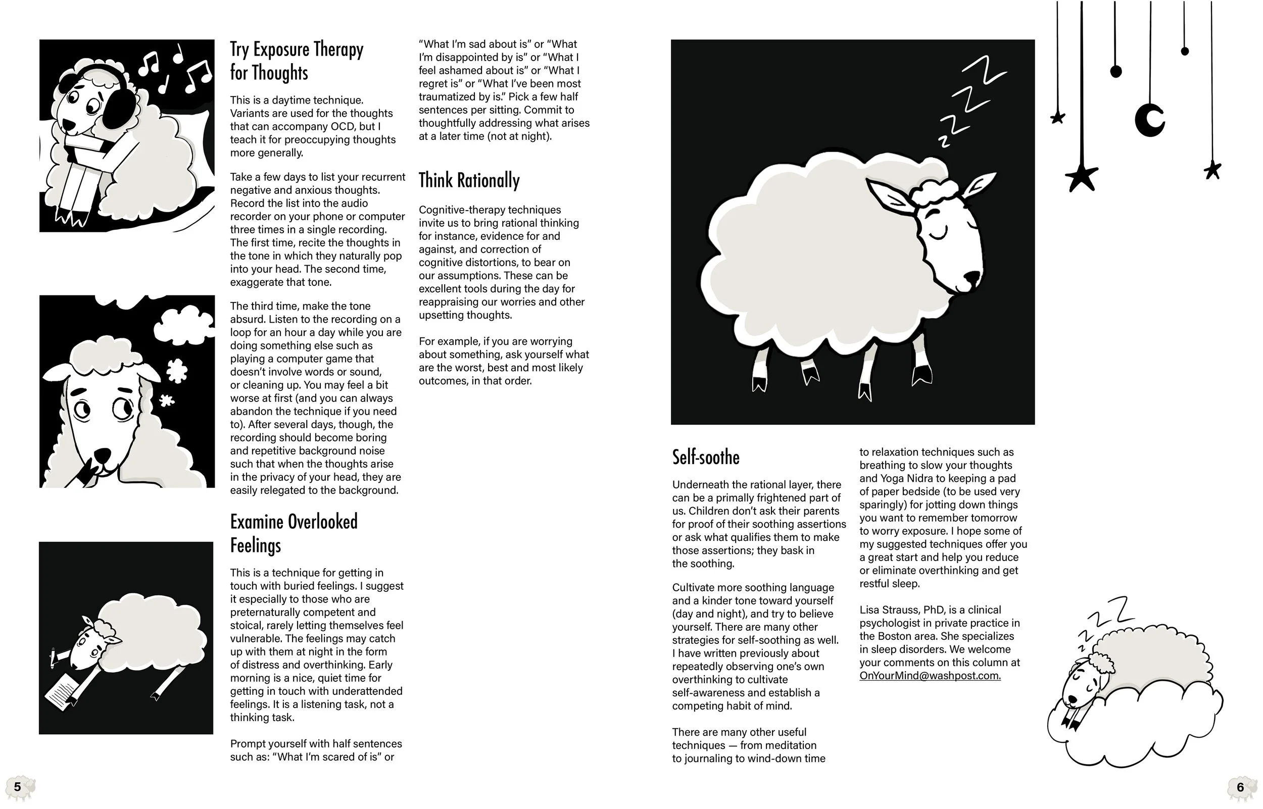
This design project uses typography and graphics to produce an editorial layout. Based on the arrangement and hierarchy of the page, I hope that readers will find a connection between the humorous pictures and the educational subject matter. Making a difficult-to-talk-about subject more humorous and lighthearted was the main issue I aimed to address with this design. I believed that by drawing relatable characters and their expressions, the reader or viewer would be more engaged with it.
Generally speaking, the idea of overanalyzing at night makes it difficult to fall asleep. Traditionally, we associate the act of counting sheep leaping over a fence with falling asleep after a certain length of time. Paradoxically, I had drawn the sheep characters as anxious and confused, while also failing miserably to finish the fence-jumping scene. In this manner, if the reader is experiencing similar feelings, they can relate to both the article and the restless sheep. I started coming up with several iterations for the sheep who couldn't sleep. Procreate was used to create the final illustrations, and Adobe InDesign was utilized to design the typography and layout of the editorial.
This project is a reflection of my creative process, as I aim for an emotional connection between my work and the viewer/user. I believe that using illustrations gives one the chance to communicate sentiments and emotions in a way that the audience can understand visually.